In 1968, Stanford professor and eminent ecologist Paul Erlich published a book, The Population Bomb, that predicted imminent, dire consequences to human overpopulation. At that time, the world population was about 3.5 billion people, or about 24 per square kilometer of habitable land. The book inspired environmental and political movements, but the predictions of global famine have largely not been fulfilled. With little fanfare, the UN estimate of the global population reached 8 billion people in November, 2022, with a density of about 54 people per square kilometer, much higher than in 1968. But the ”population bomb” is less of an explosion than it is a long burn, and the responsible parties are different from who they were in 1968.
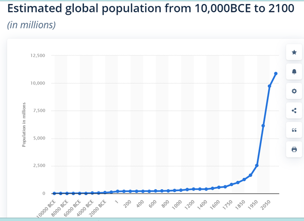
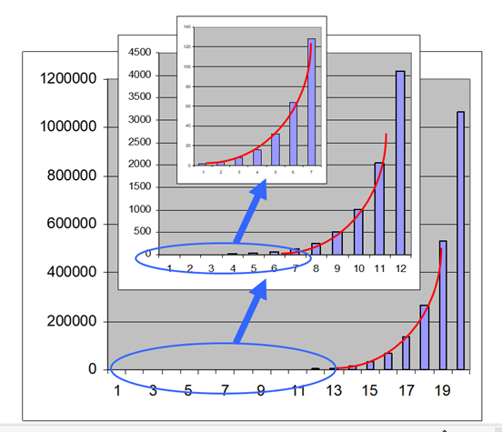
While Professor Erlich intended the analogy to be like a ticking time bomb, I will refute the assertion that we are witnessing a population explosion. Consider the graph showing world population, above. Every time you have ever seen such a graph it is used to show that there has been an explosive increase, and isn’t that scary! But, this is a false narrative, a result of plotting an exponential growth on a straight arithmetic axis, based on the highest number. At every point along the curve the population is growing at the same rate, but it just doesn’t look like that when we use as a comparator the largest value. Below, I have drawn the curve for doubling, (2, 4, 8, 16, 32, 64, 128, etc.) and readers will note that if you cut the top of the curve off and plot the flat part that remains against its own highest value (inset), the flat part takes on a curved growth. Or, in reverse, none of the small early increases look like much when you compare them to the more recent, larger increases. But the rate of change is the same. Try it yourself by drawing a few plots on your napkin at the cafe. This means that there was no explosion, it is just burning at a steady rate of change. So, looking at the curve above, there is no reason to believe that something special happened in about 1850: the plot is just math, not biology. If you were to cut off the most recent 2,000 years and plot again, it would still look the same way. There is no implication of causality in this curve, nor any evidence that we are on the edge of a crisis (I think we are, but for a different reason, below.)
Demographers use several measures to define population growth, and sometimes the values are confused in news reports to the public where they may all be called “birth rate” or “fertility rate” despite the fact that studies measured different things. The most common measures are the number of children per child-bearing woman, or the number of births per year per 1,000 women of reproductive age, or the number of births per year per 1000 individuals in the population. These values vary: for example, the first tries to capture life-time reproduction per woman, whereas the second is annual production, so the exact same raw data will provide different rates, which may be confusing when comparing different studies.
No matter how we calculate, global estimates of human fertility are declining. In 1900, reproductive women were calculated to have on average about 5.3 children worldwide. Now, in most developed countries, that rate is close to or below the replacement rate of 2.1 children per woman (that is, the mother replaces herself and the father of the children, plus a little extra to account for people who die before reproducing.) This means those countries are losing population.
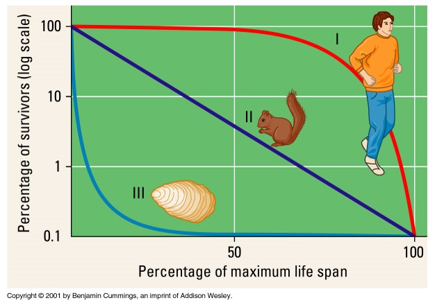
Learning from animal ecology, species tend to have more offspring when there is greater risk of mortality prior to reproduction, and fewer when survivorship is expected to be strong. Species that rely on a high replacement rate are called “r-selected” (r for rate) while those that track a constant value through reliable survivorship are called “k-selected” (k signifying constant). We can plot species survival to see these differences. Oysters are the model r-selected species, producing millions of eggs, most of which die rather quickly, but if an immature oyster makes it past a year or so, it is likely to live a long time. Humans are good k-selected species, with most individuals living past reproductive age before dying. Human culture has tuned some of our behavior so that if there is higher infant mortality, as in pre-industrial societies or among the poor in the industrialized world, then women have more babies.
To consider the effect of different rates of reproduction, let’s assume there is no early mortality and sketch out what it means if women have four children each, doubling the population every generation. Each woman gives birth to four children (two of whom are female), who then give rise to eight grandchildren (four of whom are female), then 16, 32, 64, etc., simple doubling. Quite quickly, the numbers can become large. This is what we mean by “exponential growth” because in this case it would be the numeral 2 raised to the exponent that corresponds to the generation (2 squared is 4, 2 cubed is 8, and so forth). The highest sustained rate of reproduction known for humans was in Quebec around 1900, when the average married woman had about 12 children (versus only 4.1 in the rest of Canada). This would lead to not a doubling each generation, but multiples of 6. Instead of escalating as 2, 4, 8, 16, it would be 2, 12, 72, 432. Human females are capable of great reproductivity, even if they rarely do so. Indeed, anthropologists can relate interesting customs among pre-industrial societies that were directed to limiting fertility, but those are for someone else’s blog.
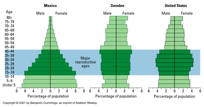
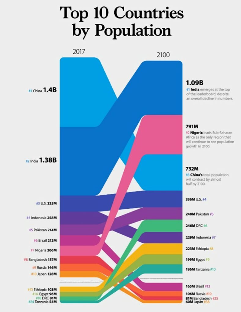
In the 20th Century, developed nations of the West were accustomed to imagining the rest of the world as a sprawling mass of poor people who have lots of babies. This prejudice is implicit in the figure above that contrasts Mexico with Sweden. This was never a valid generalization, and would not explain overpopulation because where people have lots of babies is also where they suffer high mortality. Further, because of education, improved choices for work, and greater societal stability, the same nations that were most populous in the past have among the lowest birth rates today. India has a birth rate of about 2.2 offspring per woman, which is actually below replacement rate across much of the nation, while China is at about 1.7, distinctly below replacement despite relaxation of the “one child” policy. The top ten most populous nations are expected to change dramatically in the next decades, with most of today’s leaders losing status. The US and Pakistan will basically hold steady, and in the case of the US that is due to immigration, not actual birth rates. In the meantime, Africa is growing.
So, do we have a crisis related to our population? Absolutely, but it’s not what people casually think of. Today, scientists broadly agree that the most pressing global issue is climate change, which itself is a product of high human populations and their activities. Affluence of the developed world is the cause of the greenhouse gases that are the critical problem. Everyone else on the planet would like to enjoy that affluence, to have a car, or eat meat, or enjoy other energy-consumptive products and habits. As our population grows, and as more countries become affluent, so climate change must get worse. Consider that if the 1.4 billion people in China (which is now a middle income nation, no longer an agrarian poor one) have enough income that everyone can eat just one more egg per week (hardly an earth-shattering change), that would be 73 billion eggs per year, all of which have to come from chickens that were fed, kept in an illuminated and heated hen house, whose waste had to be disposed of, etc. There is no explosion, it is a steady burn of what we do every day, all 8 billion of us.

